28. The Shearing Layers of Design Education
or, thinking about the enduring adaptability of Stewart Brand's famous diagram
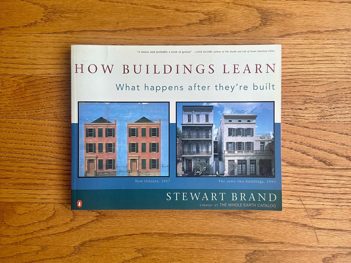
I often get asked — in various interviews, personal conversations, for roundups — about my favorite books. The stock answer I've given for years is Stewart Brand's 1994 book How Buildings Learn. It's a book that I felt like I was marking up nearly every page the first time I read it, probably fifteen years ago at this point. Right on the second page, for example, Brand writes:
The word “building” contains the double reality. It means both “the action of the verb build” and “that which is built”—both verb and noun, both the action and the result. Whereas “architecture” may strive to be permanent, a “building” is always building and rebuilding. The idea is crystalline, the fact fluid.
I've quoted this (and adapted it, replacing the work "building" with "design") more times than I can count. It's become central to my own work and thinking in and around design. That single paragraph, honestly, is why the book feels seminal in my personal canon.
But there's another framework Brand introduces that has similarly shaped my worldview and become a metaphor I apply to everything I can: shearing layers.
Originally coined by architect Frank Duffy to describe how a building is composed of layers of change, Brand expanded the concept to six elements that all buildings have; with each one changing at a different pace: Site, Structure, Skin, Services, Space Plan, Stuff. The Site, for example, never changes: a building is always situated in the same place. It's structure, also, is fairly consistent but might see slow changes over time: removing a wall, adding an addition, etc. The space plan is easier to change and perhaps calls for more rapid variation: moving furniture and rearranging rooms. Finally the Stuff layer is always in flux, moving a book from the shelf to the table or dropping off your keys when you walk inside. The thesis here, and of Brand's book, is that buildings are not finished once they've been "built" but rather is always rebuilding, each layer moving at a different pace.
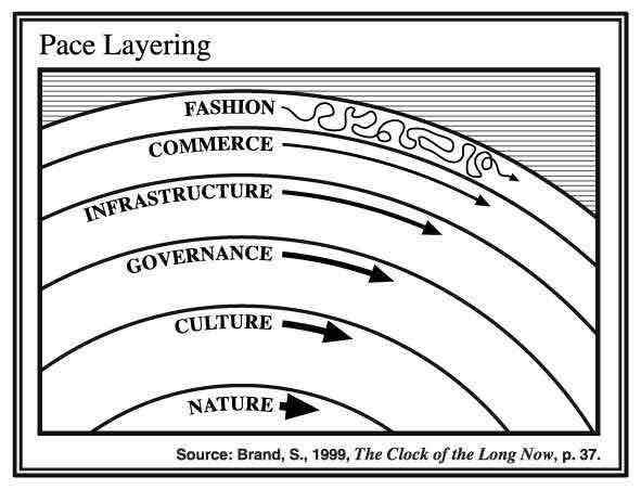
I've found shearing layers to be a fruitful metaphor for a wide range of applications. For years, I used shearing layers when talking about branding with my students as a way to think about what branding elements need consistency (fonts, colors, for examples) and where you can add variety (outputs, photography). Brand further adapted the concept in his 1999 book, *The Clock of Long Now*, with "Pace Layers" which shows the progression of societies: the fast layers innovate and the slower layers stability. "The whole combines learning with continuity," he writes.
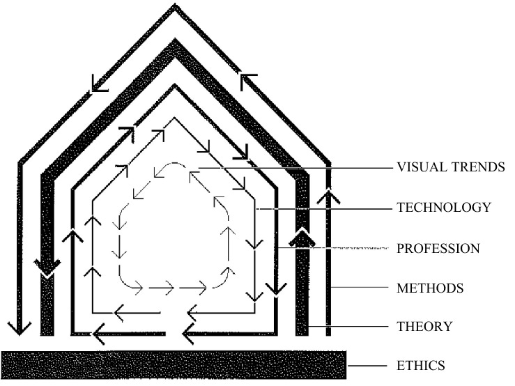
I've been thinking about design curriculums lately and once again found shearing layers to be a powerful way to think through both what we could teach in design programs and how to set up students for a long career — "a continuity of learning". Here's a quick edit I made to Brand's diagram, replacing his shearing layers with the elements of a design education:
In this diagram, we can think of each layer as an important element of a design program. Like Pace Layering, the inner labels stabilize, remaining mostly consistent while the our layers change faster. From the inside out, some quick descriptions:
Ethics: why we do what we do
Theory: how we think about what we do
Methods: how we do what we do
Profession: what the field wants us to do
Technology: the tools we use
Visual Trends: the surface of what we do, what the work looks like
It is helpful for me to think about design education in this way because too often, I think, design curriculums (at least *graphic* design curriculums) spend too much time on the outer layers and not enough time on the base layers. Curriculums are redesigned and realigned depending on visual trends, technological innovations, and professional needs. Consider the debates about whether designers should code from fifteen years ago (technology) or whether students should be using Adobe or Figma. When I first started teaching, it seemed every studio wanted motion designers and suddenly design programs were introducing motion design classes to their programs. Before that it was apps and before that it was HTML. Or think about how every digital designer's portfolio looks the same with interface after interface of rounded rectangles, sans-serif typography, and shades of blue. It seems to me building a design curriculum around those three outer levels is a fool's errand. The pace of change is too fast that the program will quickly fall behind and the energy to update and shift will impede, rather than promote, innovation.
That's not to say these layers are not important. They are! Design programs must be on top of the latest technological innovations and the standard tools of the industry. They must know what the field needs and be on top of visual trends. But these are not what a curriculum is based on. Instead, I propose building design curriculums around the slower layers, what I'm calling ethics, theory, and methods.
We can talk all we want about digital vs. print design or UX versus book design but at the end of the day, the processes are largely similar: behind the output the design process is about creating an experience, an exchange of information. Methods include research, prototyping, process, and thinking. After this, design theory provides students with an intellectual framework about how design exists in the world. This might include design history and theory but also adjacent fields like media theory and political economy. This, of course, touches on the outer layers: students could be equipped to understand where trends come from and how they evolve. They can critically engage with new tech instead of blindly following Silicon Valley.
Finally, what would a design program look like built not around technology or outputs but around ethics? Every project, every class, would be grounded in thinking about environmental concerns, capitalism and consumerism, power and inequality. Students would question who gets left out of processes and who doesn't have access to technology. They'd have to consider how the work is paid for and who is benefitting.
We're in a moment of profound cultural and technological change and this forces design program to adapt too. Instead of grabbing on to the next shiny object, the trendy tech, this is also an opportunity for design programs to reaffirm design's position in the world and why we think what we do has value. In building a design curriculum around ethics, around theory, and around methods, we can ensure the next generation of designers are equipped to handle the increasing rate of change of the outer layers. This, perhaps, is the paradox: by embracing the slower layers, students can better adapt as they tackle the outer.
My friend Sara Hendren is starting a new position at Northeastern University where she’s teaching in both the Art + Design and Architecture departments. She’s been posting notes for hew new classes on her site and this note resonated with my own thinking on design education:
I don’t really mean a philosophy of architecture as much as architecture (and design) that gets us to philosophy. To the how-should-we-live questions. Instead of starting and ending in the midrange principles of design in context (fairness, integrity, sustainability), I’m looking for ways to go right to the heart of the matter(s).
I want more design (and architecture) that gets us to philosophy! After I posted about shearing layers on my blog, she added:
I want students to have to dig into the philosophical foundations for these ethics (sometimes called meta-ethics) to see what’s happening in their power analysis. (After all, power analysis, as typically framed in the American university, has a specific history owed to Foucault and his heirs. This approach is essential! And/but it can also create the same kinds of parochial dogma that the ethics layer is trying to circumvent.)
I like the word foundations here as it mimics the language of the site.
I have two small kids so I’ve not yet seen Christopher Nolan’s Oppenheimer. I did, however, watch Jon Else’s 1981 documentary, The Day After Trinity, which I found powerful and gripping. The Criterion Channel is streaming it for free (no need for subscription) this month. I recommend it.
I also loved Brian Phillips — who is consistently one of my favorite essayists (he’s currently writing for The Ringer and his 2019 essay collection Impossible Owls is great) — reflection on the film:
Theory will take you only so far,” Oppenheimer repeats in the thrilling run-up to the nuclear blast (pouring rain, eerie light, driving music). When the blast hits, I’m thinking that the process of creating art is partly about that tension, the push and pull between theory and real life. The impulse to make art often seems to come from a feeling that real life can only take you so far: that the way to find meaning is to capture the feeling of being alive within a form that gives it coherence, a set of rules that make life make sense. And how far an artist goes toward one pole or the other, toward pure form, like Nolan, or messy reality, is part of what determines what their work can offer its audience, what they can say as an artist
Lawrence Weschler, via his idiosyncratic Substack, turned me on to Dennis Adam’s 2008 project Double Feature, a book that superimposes Jean Seberg’s character from Breathless into The Battle of Algiers:
Part of what made Adams’s image-meld so compellingly resonant was the way that, come to think of it, the blithely apolitical Seberg and Belmundo characters in Breathless would have had to have been playing out their grand passion right in the midst of all that Algerian horror (indeed within months of the particularly gory climax of the very battle reprised in Pontecorvo’s film)
I must get a copy of this now!
Miscellany
I devoured Patrick Radden Keefe’s profile of superstar art dealer Larry Gagosian in last week’s New Yorker. This is my favorite kind of New Yorker profile: full contradictions, conflicted feelings, and complicated morals.
Here’s Simon Sarris on why school is not enough.
Political Theory professor Elizabeth Cripps was on The Gray Area to talk about raising children in the climate crisis.
I’m very much into this project from new-to-me design studio Companion—Platform: a seed packet for the Are.na Giftshop. (Here’s an interview with the team and Laurel Schwulst and Meg Miller.)
Two albums I’ve been spinning a lot lately (and sound like summer, both in their own ways): John Carroll Kirby’s Blowout and Mort Garson’s Journey to the Moon and Beyond. (And the new Big Thief single is a stunner!)
Postscript
I grew up with Pee-Wee Herman and, by complete coincidence, found myself watching, yet again, Pee-Wee’s Big Adventure last week, so I was saddened to hear of Paul Reuben’s death last weekend. I appreciated James Ponewozik’s memorial in the Times:
But in the Playhouse, which recognized no governing authority other than the King of Cartoons, the only rule was that there were no rules. Reubens, as Pee-wee, pushed his audience to be accepting of the weird and ambiguous and uncategorizable. We know he was. But what are we?


